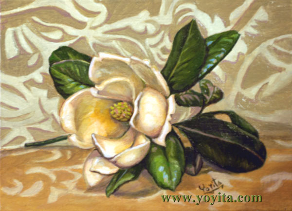
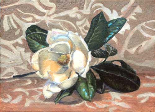
Learn to paint a Magnolia.
First we colocate the subject with a light from the left, which will give us some beautiful shadows at the right. If we don't have shadows we can not create the illusion of tri-dimentionality.
Posing the subject, we try to create an asymetric balance, trying to arrange the leaves in an interesting way.
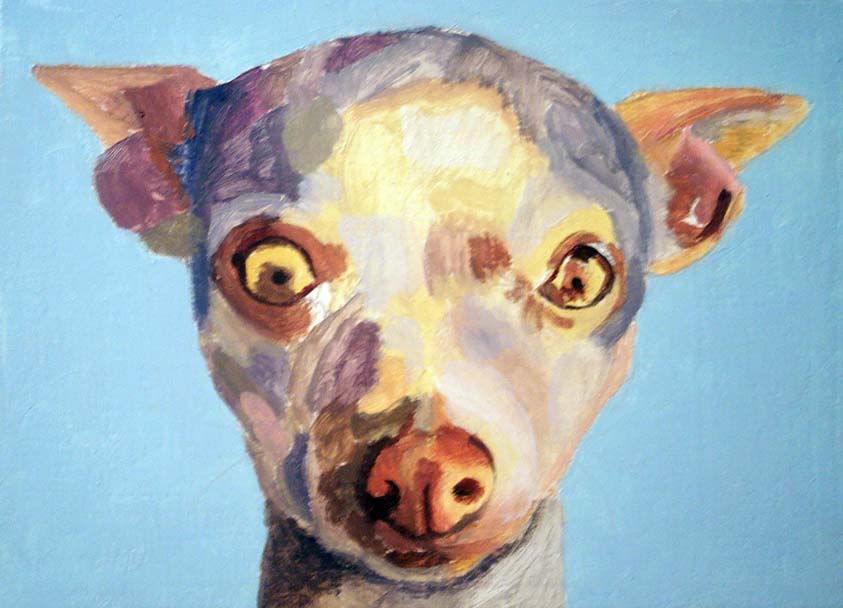
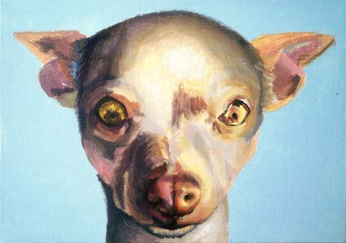
We draw the subject and then we start filling up the white canvas. When we have the first layer and the canvas complete covered, then we can analyze the colors balance and the relation among them.
|
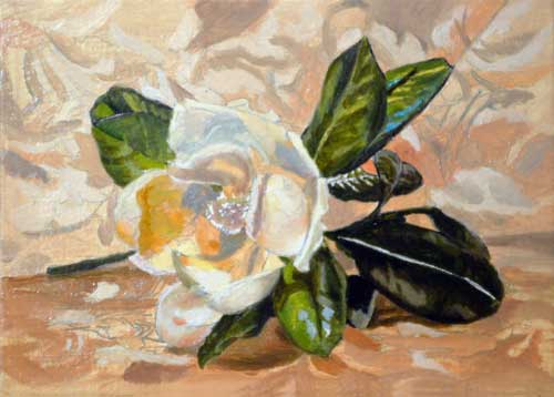
I have separated the background mixing the color withsome blue, to send it back, painting some of the desing on it.
I detailed a little more of the leaves and worked on the magnolia, trying to cover the drawing. |
|
|
A Composition Check List by the members of Wet Canvas
A check-list is simply that - a check-list. A tool to jog your memory,
or to use when you want to assess your work. A checklist should not include
volumes of "how to" items, but merely reminders.
If something on this check-list does not mean anything to you, then you owe it to yourself to find out more about it, and there are masses of good books one can spend hours browsing in order to educate yourself.
Things to look for, do or dont do.
1. Look that all objects are similary shaped or that they follow a
theme.
2. Check that objects do not "kiss"
3. Are your Value’s pleasing and add to the work rather than distract.
4. "BE AWARE of the negative shapes". It is easy enough to be aware of your positive shapes - the hill, the tree, the bowl, the jug - but all too often, people forget that the negative shapes - the spaces between and around objects, are just as important as the positive shapes, and need to be thought about. Why? because a painting is, in fact, a flat two-dimensional rendering, and every passage of that painting is, in fact, like a part of a jig-saw puzzle, and needs to be considered in relation to all the other parts of the painting.
5. Consider the placement of your centre of interest - and how you drew attention to it - here are some ideas - "pathways" (lines and angles create directions) thru the pic leading the eye to the focal point; maybe the use of counterchange; stronger contrasts of tone at that point; contrasts of colour at that point; harder edges.
6. Is there order, and unity in the picture ... unified shapes and patterns can be imposed on a picture, but without some variety, it will be rather bland. For example - a picture made up entirely of curving elements may have unity - but without some variety, it will be monotonous.
7. Beware of lines that draw the eye OUT of the rectangle, and particularly beware of lines that touch the corners, it will create a really strong, outward pull.
8. Ok here's a joint one - when working from life, looking at your subject, remember to SQUINT LIKE MAD - ideally THROUGH A VIEWFINDER. Squinting simplifies colour, joins
close-toned shapes/areas together, and helps you to "see" the composition in terms of its light and dark plan. The viewfinder helps you to place your composition within four edges, an important consideration - one must always take those edges into account. Squinting almost ELIMINATES colour, making it easier to read basic values.
9. Are there any "Tin Soldiers" in your composition? For example, are there trees that are evenly spaced that do not follow the rule "repetition with variety", that should be varied in height and distance or color? Objects are not usually lined up evenly.
10. If one applies the rule of variety to all these elements when doing a composition, chances are one would have a quite interesting painting. Squint your eyes and try to find the underlying structure ( values pattern ) of a good painting, which is its soul !!
1) Line.
2) Shape.
3) Color.
4) Value.
5) texture.
11. Are your negative shapes interesting or do they complement the piece?
12. Consider the Golden Mean in your compositionto start, it is a reliable guideline that
suits most artists' sense of organization. however, the golden mean is not
very dynamic.
3. Have you chosen the proper canvas size to accomodate your composition. the
picture plane will lead the eye. in fact, when you do your thumbnails, try
drawing the objects first and then ruling in your canvas borders around them
afterwards.
14. Negative space/positive space,,,it doesn't really matter if you are aware, because each affects the other. but emphasis is placed on negative space because it is a kind of "double check", since people tend to just drop their objects in a composition THINKING they are creating organization.
15. Where you place your objects mean absolutely nothing if you don't organize your values. VALUES make the world real. values allow you to "read" the world. without values, everyone would walk around in a fog and get run over by cars driven by everyone else because they had no depth perception.
16. don't place objects tangent to each other. either overlap them or seperate them distinctly. Everything supports your focal point. and don't be shy about expressing it.
17. Have you used your composition as an emotional tool?
18. If you break a "golden rule of composition" have you pushed the idea to an extreme? If you are wishy washy about the execution, you end up with a wishy washy idea,,,,,,and a wishy washy painting.
19. Does your composition use color to move your eye around the picture?
20. Consider the lines, do diagonal, vertical or horizontal lines lead the viewer out of the picture that can be done another way?
And these tip's by Henrik Lindberg
Positive Check List
Focus/impact area - An effective focus/impact area makes the difference between a picture and a work of art. The impact area gives the viewer direction and establishes a sense of priority for all the other elements. A focus/impact area means that the artist has been able to capture what in real life is selective seeing - we can only focus on one thing at a time, the rest is seen through peripheral vision. Does the work have such an area?
Mood/feeling - Does the work convey a mood? Decide if it is merely rendering of parts or if there is a sense of interpretation and feeling.
Creativity - What has been done better, or differently, from the ordinary? Was creativity used in the selection of subject and/or use of materials?
Composition - design - Are there interesting shapes - both positive and negative? Is there a variety of shape sizes? Are the picture elements arranged in a dominant design scheme - for example with rectangular or diagonal emphasis? Is the design based on one or several geometric forms and, if several, do they work together? Does the design work with, or against, the subject? Does it attract attention to itself (i.e. the arrangement takes over the subject)? Is the composition balanced?
Composition - counterpoint - Evaluate the complexity of the subject and the selection of shapes used. Look for a dominant element, subelements and repetition of elements. Is there variety/counterpoint? In general, the more complex the better - without going over the top. Remember the rule: ”Diversity within unity”.
Value - How has tonal value been used to convey mood, depth, dimension, and impact/focus? Look at the composition of general tonal areas.
Color - How has color been used to convey mood, harmony, and depth? Does the color scheme fit the subject? Has color been used to establish a focus/impact area? Check for the use of color fundamentals like complementary or analogous color.
Other fundamentals - Evaluate the use of other fundamentals (besides color and value) such as perspective, edges, and style. How does perspective help to convey depth? Is perspective used creatively? Are hard edges used to pull elements forward and soft edges used to integrate elements in the scene? How is style used to promote the intent/mood?
Unity - Unity is what holds all parts together. Has color, pattern or technique been used to establish unity?
Craftsmanship - This is where the technical skills such as drawing and the handling of materials are assessed.
Readability/flow - Can the viewer's eye move easily into the work? How has the artist used shape, line, value, color, perspective, etc to guide you to the focus/impact area, to/from sub-themes and away from exit areas?
Negative Check List
Technical inaccuracy - Does inaccurate drawing make elements work against the logic or intent of the composition? For example, shadows that fall in the wrong direction, a sloping horizon, errors in perspective for realistic art.
Lack of imagination - Poor selection of subject and approach. A dull subject rendered in a dull way.
Lack of originality - Presenting a trite subject that has been painted a thousand times before.
Content discrepancy – An element that is not in character with the logic or intent of the work. For example: the artist intends to make a realistic wildlife painting but shows the animal in the wrong environment.
Style discrepancy - Inconsistent styles within the same work, or the obvious influence of another artist’s style in parts.
Inconsistent quality - Landscape good, wildlife weak.
Easy way out – The artist has obviously positioned a subject to avoid difficult detail.
Plagiarism - The artist has copied another's work, or used someone else's photographs, and presented it as their own. (This also has legal implications.)
Lack of interpretation - The artist was controlled by the subject. For example, including the shadow of a photo flash, or rendering a subject's eyes with effect of photo flash; a pleine aire artist has included an ugly object which detracts from their landscape simply because it was there.
Poor presentation - How is the work presented? Is it free from the non-artistic use of coffee-stains, globs of paint, brush hairs stuck in dry paint, fingerprints, shoddy frame, poorly cut matte, sloppily painted edges of canvas, canvas shining through, poor/uneven varnishing, cracks, scratches, etc?
Empty - No mood, message or feeling conveyed.
|
|